Case study
Personal Portfolio
The website you're looking at right now!
why
I wanted to build this portfolio because I felt like a résumé could only tell part of my story. Sure, it can list the languages I know, the projects I've worked on, and the jobs I've worked at, but it fails to show how I think, what I care about, or the things that I spend my time creating.
So instead of making another average portfolio that just lists my experience, I wanted to build something that felt like me. A place where I could show my work as a developer alongside other things that influence me: cars, music, photography, and whatever else I happen to be doing. Those things might not fit neatly into a résumé, but they are still a big part of how I approach creativity and problem solving.
I also wanted the website itself to be a part of the portfolio. Rather than starting from a template, plugging in my information, and calling it a day, I decided I wanted to design and build something from scratch where I could experiment with ideas, learn new technologies, and occasionally make things harder for myself just because I thought they would look cool.
More than anything, I wanted a space that can keep evolving with me. I'll build new projects, pick up new hobbies, learn new technologies, and probably change my mind about how this website should look a hundred times. The whole point is to continue building and updating it as I figure out where I'm headed next.
the website
The website is built with Next.js, React, TypeScript, and Tailwind CSS. I was already familiar with React going into the project, but this was my first time building something with Next.js and Tailwind, which gave me an opportunity to take a framework I was comfortable with and approach it in a completely different way.
Architecturally, the site follows Next.js's App Router. Pages are organized by route, a shared layout handles global elements, styling, and analytics, and interactive features are separated into client components where needed. I also tried to keep the site component-driven, breaking repeated UI and behavior into reusable pieces rather than rebuilding the same thing for every page.
Most of the portfolio's content currently lives in TypeScript data and Markdown. This works well at its current scale and makes it easy to build custom case studies like this one, but I don't want content management to depend on hardcoding everything forever. One of my next steps is integrating a CMS like Sanity, allowing new projects, hobbies, and case studies to be added without having to modify the application itself.
design
From the beginning, I wanted the portfolio to have a minimal design language without feeling static or generic. Most of the interface is intentionally simple, which gives me room to sprinkle in animations and interactive elements without having every part of the website compete for attention.
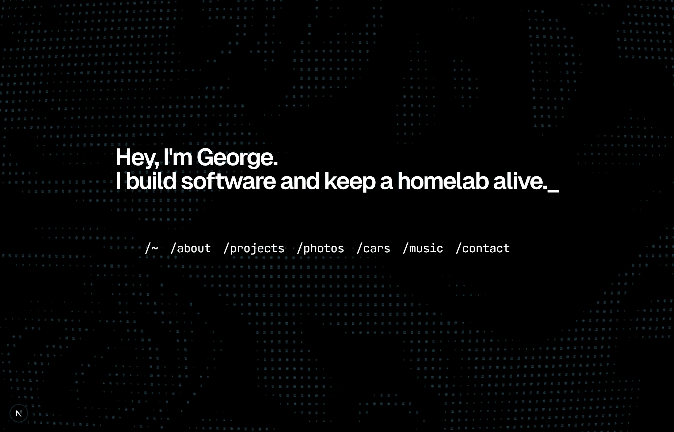
One of the biggest examples is the homepage, which uses a mouse-reactive WebGL terminal background. I wanted the landing page to immediately have some personality while still keeping the actual content front and center. Smaller details, like animated typing and page text transitions, build on that idea without turning the website into one giant animation.
The music room gave me another opportunity to experiment. Audio playback is connected to a live waveform using the Web Audio API, creating a visual element that reacts directly to the music being played. It was a fun way to combine something I care about outside of programming with something technically interesting inside the project.
A big part of the design process has been figuring out when not to add something. It's easy to keep throwing animations and effects onto a portfolio, but I wanted the interactive pieces to feel intentional. The goal was never to make the busiest website possible. It was to build something that feels distinctly mine while still keeping the projects and content as the focus.
challenges
Because this was my first time using Next.js and Tailwind CSS, a lot of the early development involved learning how they wanted me to structure and think about the application.
Coming from mostly Bootstrap and Ionic's default styling, Tailwind initially felt much more verbose than the styling approaches I was used to. As the project grew, though, I started to appreciate how quickly I could iterate on a component without constantly moving between markup and separate stylesheets. What started as one of the unfamiliar parts of the stack eventually became something I really enjoyed working with.
Another challenge was balancing animation with accessibility. I wanted movement to be part of the site's identity, but I didn't want that decision to make the website uncomfortable or difficult to use. Certain animations respects the user's prefers-reduced-motion setting, and I tried to be deliberate about where motion was actually adding something to the experience.
The WebGL background and audio visualizations created a similar challenge from a design perspective. Both are intentionally eye-catching features, so I had to find a balance where they added personality without distracting from the actual content. That balance between creativity, usability, performance, and accessibility became one of the recurring themes of the entire project.
Honestly what's not talked about a lot when making a website about yourself is actually filling the website with content. That honestly took more time then desgining the website. Making all of those case studies for projects that I've done over a year ago is difficult.
what i learned
The biggest thing I learned from this project is that building a website from scratch is as much about making decisions as it is writing code. There are a hundred different ways I could structure a component, organize content, animate a transition, or design a page. There usually isn't one perfect answer, and a lot of the work comes down to understanding the tradeoffs and choosing what makes the most sense for the experience I'm trying to create.
It also reminded me how much I enjoy front-end development when design and engineering overlap. Building something functional is satisfying, but I especially enjoy the process of taking an idea in my head and figuring out how to make it feel right on a screen. This project gave me an excuse to experiment with that constantly.
More importantly, the portfolio gave me a project where I have complete ownership. There isn't a rubric telling me what features need to exist or a professor telling me when it's finished. If something feels wrong, it's my responsibility to figure out why. If I want to add something ridiculous just because I think it would be interesting to build, I can. That freedom has taught me a lot about how I approach projects when there isn't directions to follow.
what's next
The funny thing about building a portfolio about yourself is that it can never really be finished.
My next major technical goal is integrating a CMS so that projects and other content can grow independently from the application itself. I also want to continue improving performance and accessibility as I add more interactive elements, while finding new ways to experiment with the technologies behind the site.
Beyond that, I expect the portfolio to change as much as I do. I'll build new projects, learn new technologies, take more photos, work on more cars, make more music, and probably redesign parts of this website more times than I should.
The portfolio started as a way to refresh my development skills after graduating, but it has turned into something much more useful: a project that can grow alongside me. As I develop as a software engineer, the site will continue developing with me.
In that sense, I don't really consider it finished and that's kind of the point.